Modernizing the
New York Public Library
for Gen-Z users
Wayfinding System, UI/UX
Ambition
How can traditional libraries be made more relevant and accessible for younger digital-native users?
Solution
Design a navigation experience that is simplifies and makes the library system more natural to Gen-Z users, helping them navigate through the space and system to successfully attain their goals.
Guided by
Dominic Poon
Duration
4 Weeks
Tools
Figma, Adobe Photoshop

Project Overview
1
Problem Discovery
Identification of problem space and what needs to be explored
2
Primary and Secondary Research
Discover target user group insights, use case, persona and user flow.
3
Research synthesis
Defining opportunity space and design challenge.
4
Design Solution
Prototypes and mockups
Problem
The New York Public Library’s navigation system is outdated, making its resources difficult to navigate across its 92 locations in NYC.
Especially in this digital age, when most users are unfamiliar with the NYPL system, the library is rendered obsolete. What a waste of great resources!
While they have been building on their online database, resources are hard to reach behind a complicated digital infrastructure that needs a level of familiarity to navigate effectively.
Solution needed
Assessing and redesigning crucial touchpoints to streamline a
multi-modal user experience
To understand what is natural to Gen-Z users and implement an intuitive physical and digital navigation process, allowing them use NYPL’s resources with ease
Secondary Research
Target Demographic: Digital Natives
Millennials and following generations have spent nearly their entire lives surrounded by computers, digital devices and the world of social media.
Born after the internet.
Unfamiliar with the library system and what resources they offer, being raised in the digital age.
Digital natives value speed and are accustomed to a Google-first approach.
The library system can be a hassle to learn and take time to get familiar with.
Primary Research
Current landscape
Click on each image to look through evidence

Wayfinding is catered to tourists
Wayfinding in the Main Branch is catered more for visiting tourists as opposed to material-seekers.

Getting familiar with the system relies getting help from a librarian + practice
Even online and in newer branches like the Stavros Niarchos Foundation Library, the system is not designed to help new users.

Online resources are not user-friendly
Terms that help users navigate different resources online are specific to the library and need users to naturally be familiar. Interface also does not encourage clear online navigation.

Lack of a bridge between online resources and materials in location
Online materials are not directly linked to where physical copies may be found, vice versa.
Survey:
Conducted on 21 individuals based in New York City, aged between 18-35, to discover current use cases within target user group, and insights to discover unmet needs.
Overview

Quotes
“I rarely use the resources. I only visit the libraries for the space itself and sometime pick up the books thats displayed in the main space.”
I was hoping that NYPL made the process of registering to get a library membership card much easier. There were several stages to getting access to things that I need and overall just very inconvenient.
Synthesis
There are 2 subgroups:
Interested and needs help
Uninterested and needs introduction

Key insights derived from research:
Digital natives have established research and reading habits.
Google-search first, Amazon books
Users are not aware of what resources are offered and how to look for them.
Resources seem hidden behind passwords and a membership, a complicated system that needs familiarity to navigate
There is an overwhelming barrier to entry to using NYPL resources.
Gen-Z users don’t like having to ask for help from librarians.
Insufficient infrastructure to support new users to navigate on their own
User Interviews
Qualitative interviews were done with 2 individuals from the survey. Their insights provide a deeper understanding to develop a user persona to improve user flow.
👱🏻♀️
Suzie, 22
Has never been to NYPL, uses NYU library regularly.
“It’s not that I avoid the NYPL on purpose, I just never think of it. Honestly never crossed my mind.”
Impressions:
Touristy, crowded, not conducive, time consuming
🧑🏼🦰
Luke, 25
Regularly goes to the NYPL and has a library card but has never used resources
Uses Columbia Library materials for research instead, subscriptions to online paid resources
“I know the NYPL is free but time is money. Online resources are crazy to navigate, too many links and buttons and I’m unsure where to look. ... I typically try and give up halfway.”
Impressions:
Unsure of what is offered, it is a conducive co-working space
Opportunity Space
User needs and touchpoints are developed based on interviews, to identify an area of focus.

User Persona
Alex Miller, junior at NYU Stern.

User Flow
Touchpoints someone like Alex would encounter and what can be redesigned to improve experience.
Unmet Needs:
1
NYPL at the forefront of their search.
Digital natives take to Google to begin any search. NYPL needs to meet them there, offering what free resources are available where they look.
2
Step-by-step guide from the comfort of their own space and pace.
Integrating the NYPL with tools digital natives are already familiar with helps with making discovery less daunting.
3
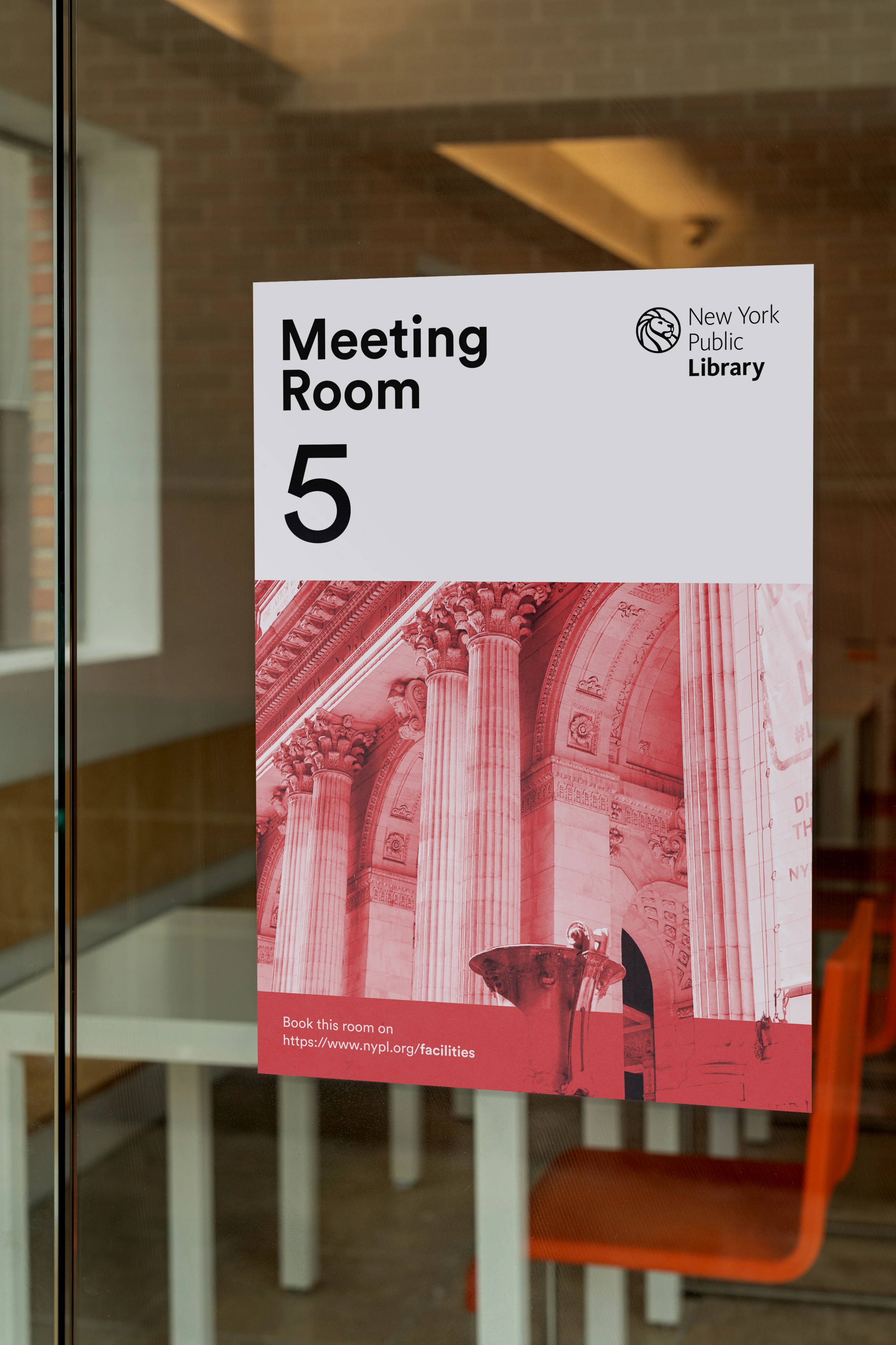
Unified wayfinding system.
Design and language has to flow from digital navigation to physical signage.
Design solution
Challenge 1
How can the NYPL increase its presence online, inviting Google-first users to use its free resources with ease?
Design solution
NYPL browser extension offering NYPL resources as solutions to user’s online queries